
Exhibition Review: Can Graphic Design Save Your Life?
Photography by Estelle Ciesla
Bruno Reynell reviews an exhibition that explores the relationship between graphic design and health.
In 1854 the physician John Snow identified a public water pump on Broad Street in Soho as the source of an outbreak of cholera. Key to this deduction was his use of a dot distribution map to corroborate his theories. A visual scatter of collected data to show the presence and quantity of a phenomenon, the map has become one of the best known examples demonstrating the importance of visual representation in the history of health and medicine. Snow’s iconic map is just one of the exhibits illustrating this relationship, which is the focus of Wellcome Collection’s Can Graphic Design Change Save Your Life?
The exhibition is divided into six sections (persuasion, education, hospitalisation, medication, contagion and provocation), each detailing different ways by which factors such as posters, signs and interior design influence our behaviour and health. Opening the exhibition is the evolution of cigarette packaging, an example of health-conscious graphic design that we are particularly familiar with in our everyday lives.
Bright attractive packets from the past, provided by tobacco brands like Lucky Strike, line up alongside the plain packaging of those from today, and the difference in appeal is stark. Accompanying explanations detail the time and care that has been taken to inform design-related decisions. For instance, market researchers in Australia determined that Pantone 448 C (a horrible, drab, dark brown) was the most unattractive colour shade possible, and since 2012 it has been used to cover all tobacco products in the country.
However, not all graphic design works in such an overt way; sometimes it takes more subtle forms. The intriguing section medication examines, for example, how we decide which drugs we need, and how something as simple as the appearance of a packet of aspirin can influence this. Equally important is the concept of trust, and we see how Big Pharma has invested huge amounts of time and money honing designs to try to manipulate our health-related decisions.
Another point of interest is the timeframe encompassed by the exhibits. We see diagrams of human anatomy dating from the 17th century presented alongside modern-day mobile apps such as Pocket Anatomy. The aim of both is to educate through graphics, but advances in technology lead to new possibilities. For example, another exhibit demonstrating the creative use of today’s technology is the Mosquito Killer Billboard, put up in Rio de Janeiro during the 2016 Zika epidemic in Brazil. It works by emitting a sweat-like vapour that attracts mosquitoes, which become trapped and eventually die. Although it only killed around 100 mosquitoes a day, the billboard’s striking presence also helped to raise awareness of the virus.
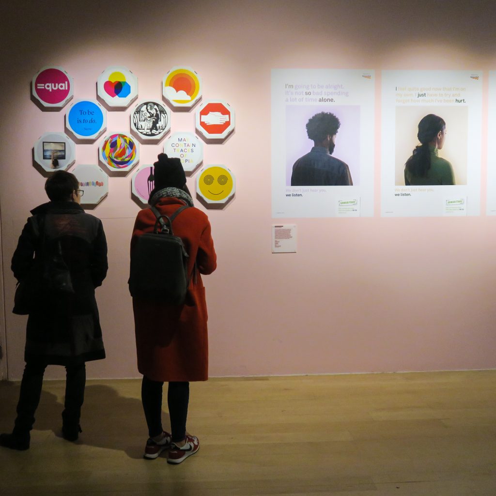
This connection between visual representation and health explored in Can Graphic Design Save Your Life? is not always immediately obvious. In fact, upon suggesting to a friend that we go and see this exhibition, I received the blunt reply of “Nope. Graphic design cannot save my life.” His assertion, confident but misguided, is assuredly disproven by each of the 200 plus items on display.
Can Graphic Design Save Your Life? runs at Wellcome Collection until 14th January 2018. You can find out more here.